So last night a friend and I were were discussing politics, life, the universe and everything. He seemed incredulous that I thought that from some measurements and perspectives the economy was doing quite well and that from other points of view it was doing quite poorly. I believe that it was his impression that the economy was doing poorly. This morning after having blood drawn I went and looked up a few graphs to illustrate what I was talking about.
All of the graphs come from the same source the Federal Reserve at St. Louis.
So street level, how does this economy look to the person who is working for a living?
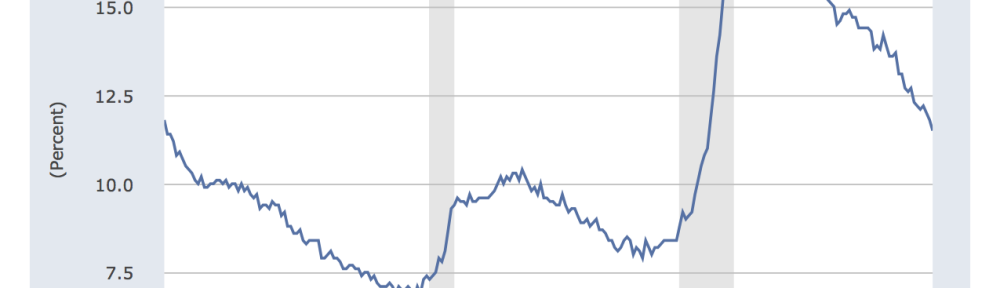
Employment: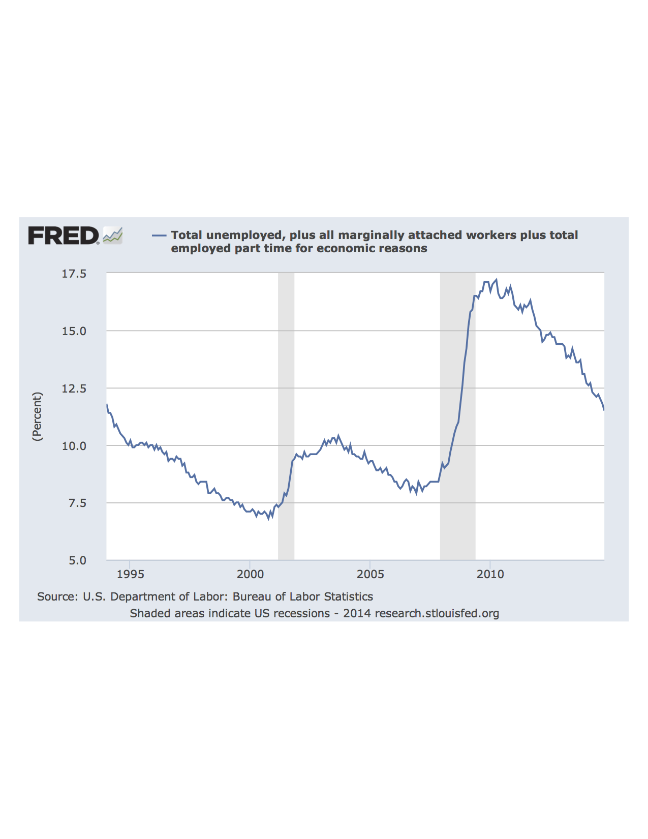
So from this graph it’s quite clear that employment, while improving has yet to recover fully from the disastrous financial crisis of 2008. Bad for the working person.
Household Income
Median Household Income has only recently began to recover from the 2008 crisis. As you can see in the graph, the household income continues to fall even after the recession had ended. Bad for the working Person.
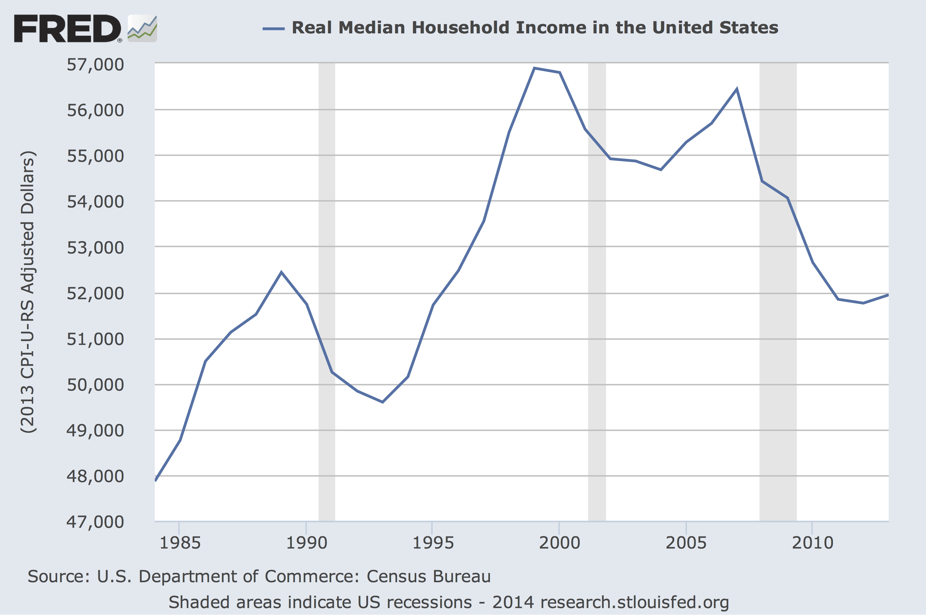
Stock Prices
Stock prices have fully recovered are in fact higher than before the crisis. The stock market is going like gangbusters.
Corporate Profits
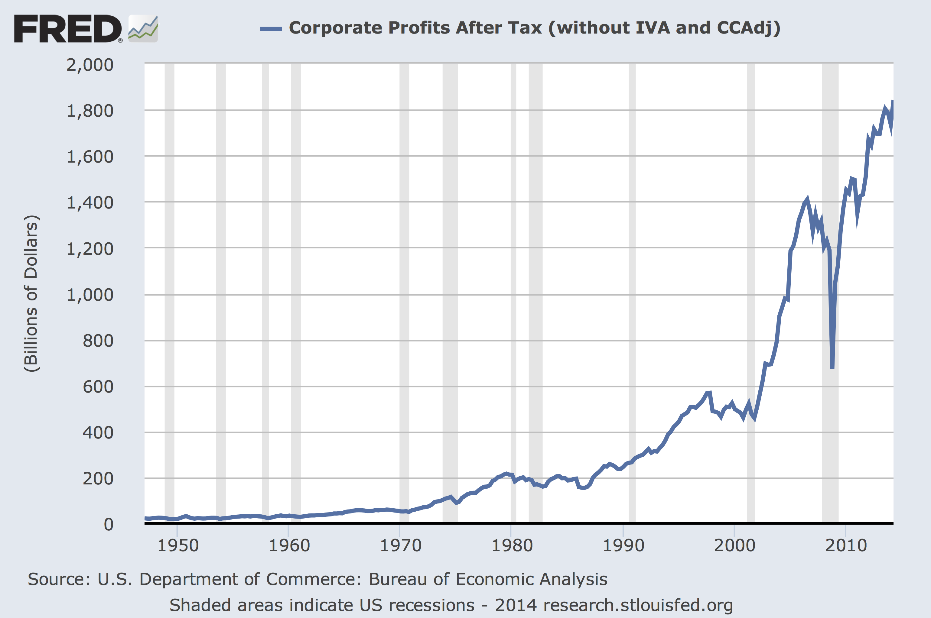
Corporate Profits have fully recovered from the crisis and just as with stock prices are now higher than before the crisis.
I think that this is one of the essential driving forces in the ‘throw the bums’ out mood of the electorate in the 2014 Midterms. The working person isn’t feeling like that they are in an economic recovery, their view is that jobs are scare, the jobs available are not as good as the ones that they used to have and that their incomes are low. Where this leads I do not know, but it will be interesting.

Another interesting article on the decline of employment.
http://www.nytimes.com/2014/12/12/upshot/unemployment-the-vanishing-male-worker-how-america-fell-behind.html
correction
“Annual U.S. GDP growth 2010-2014 was only 1.9%!”
This statement is incorrect. I misread the tables from one of the sources I cited.
Correct reading of the tables shows economic growth from 2010 through 2013 averaged 2.25% of GDP.
Interesting survey regarding employment.
http://www.washingtonexaminer.com/giving-up-40-women-28-men-39-youth-dont-want-a-job/article/2556177
Here are some nice graphs about U.S. debt.
http://www.economicshelp.org/blog/6775/debt/total-us-debt-public-private/
The good news is total U.S. debt relative to the GDP has slightly decreased since 2008.
One more to add to your graphs.
http://data.worldbank.org/indicator/NY.GDP.MKTP.KD.ZG
Annual U.S. GDP growth 2010-2014 was only 1.9%!
Hmm… how much did U.S. population grow during same period?
http://data.worldbank.org/indicator/SP.POP.GROW
Annual U.S. population growth 2010-2014 was 0.7%.
That’s why I didn’t believe the U.S. economy had recovered to pre-2008 levels and why I believed the U.S. economy was treading water.
Over the years of the Obama administration I have been paying particular attention to the record of GDP growth. Without fail every initial rosy report by the Feds later got downgraded to the miserable results of less than 2%.