I believe that the central challenge, politically, for our age can best be expressed in a single graph from the Economic Policy Institute.
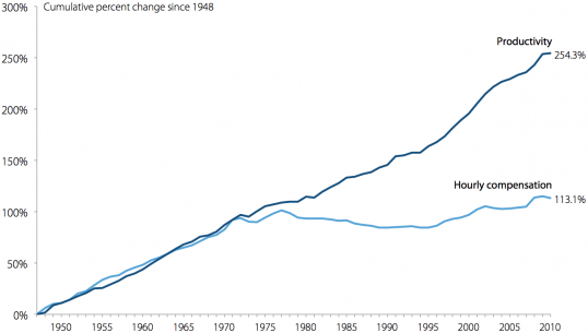
Quite simply, in real dollar terms, wages have been effectively flat for 30 years. This effect has been masked by easy credit, and a real estate bubble, but the underlying core condition is a grave one.
What cannot go on will not go on, House prices cannot rise forever and a consumer driven economy cannot survive if the consumers do not posses the excess money to go out and consume.
I propose no solutions. I know of no magic wand that will reunite these tends but something will happen. Whichever political party or ideology that finds and implements a solution to this will reap tremendous benefits, those that stick their heads in the sand are likely, in the long run, to get their asses kicked.

The Bureau of Labor has a graph that is very much the same on the same data, (I;m at work and can’t link to it right now) so I doubt that this is primarily a reflect of source bias. I have seen this is a number of places from a number of sources.
Hourly compensation is to separate it out from other form on compensation that tend to use captial (such as stock options) to compensate.
Ugh. MEGO.
I already believed there is a distribution problem with the American economy. But is it as bad as the graph presents? Maybe. But maybe not.
First I looked at the source.
http://www.epi.org/about/
Right. Not exactly a source without a point of view. I’ve seen too many examples of slight-of-hand games played with statistics in order to mislead the public who are concerned about gun-control policy.
But who knows? Maybe the graph is fine. But no way am I going to accept it without first having a glance at the details of the graph. Just what do they mean by “hourly compensation”? Is that the same as “wages”?
So I start to read the graph details from the link, and already I can see it would take too damn much time to pick apart all the qualifiers. And I could almost immediately see that picking would be necessary when one of the first sources they cite about disparity of income references a time span of 1979-2007, which I immediately suspect is cherry picking dates to skew results.
Ugh. MEGO.